Matplotlib: Space Between Subplots
When it comes to programming, there are a number of tasks that I spend time learning by searching the web and then subsequently forgetting by the next time I need that skill, so that I have to search the web all over again. This happens a lot when I try advanced plotting techniques in Python/Matplotlib. To avoid that in the future, I am going to use these “Today I Learned (TIL)” posts as notes for future Alejandro, so he doesn’t have to spend so much time re-discoverying how to make Matplotlib plots.
I often make figures with multiple plots, which is straightforward with the plt.subplots command. The tricky part is getting all of the figure and plot parts spaced out in a readable manner. I used to use tight_layout, but that was never predictable and I didn’t really understand how it worked. No I am trying to use plt.subplots_adjust to make my subplots look great.
Let’s see how this works with an example. First, I will import some packages:
import numpy as np
import matplotlib.pyplot as plt
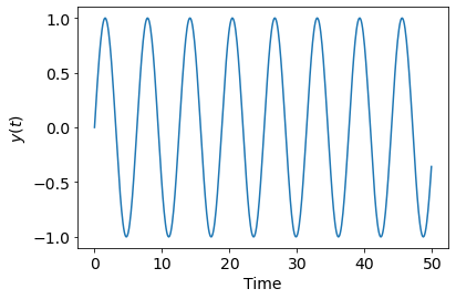
Now, let’s create some data to plot. Sine waves are always fun, so let’s start by create a time array, $t$, and then a function $y$ that is a function of time and related to $t$ by $y = sin(t)$. In Python, this looks like:
t = np.arange (0,50,0.1)
y = np.sin(t)
Plotting $y$, I get:
fig, ax = plt.subplots(1,1)
ax.plot(t,y)
ax.set_xlabel('Time')
ax.set_ylabel('$y(t)$')
I am already using subplots as well as the object-oriented interface, because this is, in my opinion, always the best way to make plots. And we are already setup to look at multiple plots. I am going to try that next. I am going to plot $y$, $2y$, $y^2$, and $y^3$ in a two-by-two array. Let’s see how that looks:
fig, ax = plt.subplots(2, 2)
ax[0, 0].plot(t, y)
ax[0, 1].plot(t, y*2)
ax[1, 0].plot(t, y*y)
ax[1, 1].plot(t, y*y*y)
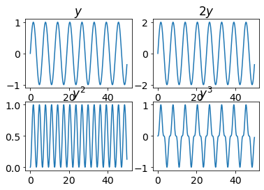
Oh, man, that’s a mess. The labels are running up against the other plots, and you can’t read the titles on the second row. You never want that. So let’s try ysing the plt.subplots_adjust to fix this mess. Here’s what that looks like:
plt.subplots_adjust(left=0.1, bottom=0.1, right**=**0.9,
                    top=0.9, wspace=0.4,hspace=0.4)
The plt.subplots_adjust command sets the spacing between the various subplots in your figure. When using this command, you set four parameters, wspace and hspace. wspace is the fraction of the axis width while hspace is the faction of the axis height. The other parameters, left, right, top, and bottom, determine the position of the four sides of the subplots. These are in fractions of the width and height of the figure, not the axis. The parameters wspace and space are the keys to keeping the plots separated.
Here’s what I get when I put this all together:
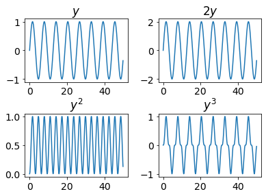
Much better. And of course, I can keep getting fancier and prettier with this, but that’s for a different TIL post.